Ness Point
by Tonkin Liu
Client Private
Awards ���������� South East Award 2017 and House of the Year shortlist
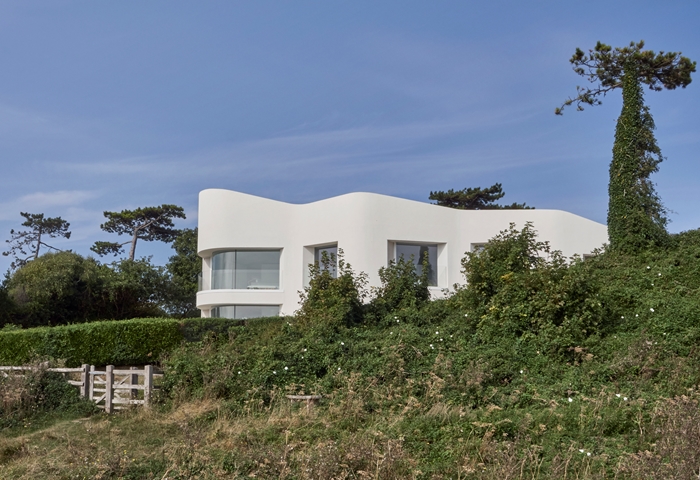
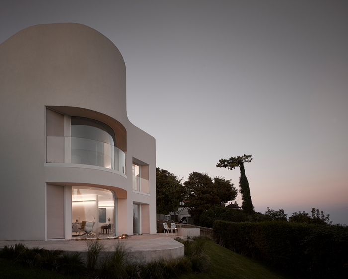
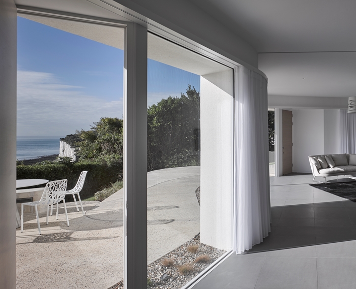
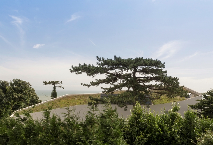
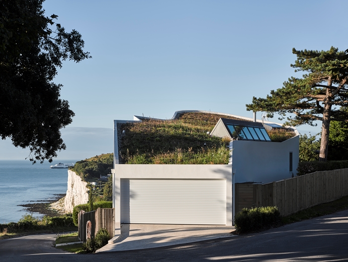
Ness Point has been designed as if it had grown out of the land in which it is embedded. With undulating thick walls along its length, it hunkers into the hill and is at one with the dramatic landscape of the White Cliffs of Dover. It goes further than respecting its setting, to really speaking of ‘place’.
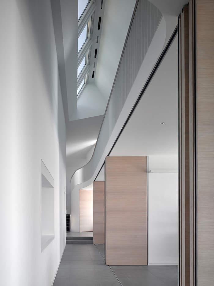
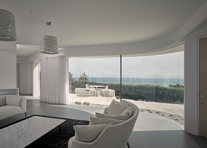
The plan of the house, whilst modest in scale, very much describes a journey as you move through each floor with framed views which pull the landscape into the house. The orthogonal central walls serve as dividers for the various functions of the ground floor but do not meet the undulating external wall, so that you are able to weave through the series of rooms and there is the feeling of skirting along the side of a cliff face. There is an extremely sophisticated manipulation of space, whereby your eye is constantly pulled from one space to the next but each space nevertheless holds on to its own clear identity. As you reach the end of this spatial sequence and turn the corner (as in the prow of a ship), there is a space you can shelter from the weather (sea mist on the day we visited) that appears carved out of the rear of the plan.
Upstairs, the plan continues as an enfilade suite of bedrooms. Each room is orientated towards a different aspect of the landscape, across the passing ships of the English Channel to the cliffs known as Ness Point. The spaces are modest, the plan tight and every inch is put to good use. This house has been designed from the inside out. The driver is the emphasis on the interior activity and how each space is occupied. Each bedroom has a balcony no wider than half a metre, which gives a miniature, personalised garden to each bedroom. The interior detailing is beautiful and meticulous. This project benefits from a very successful collaboration between architect and interior designer which is much more than the sum of its parts. The interior catches the dynamism of the day’s changing light so that the building becomes a part of the larger canvas of ever-changing coastal weather. On the day the jury visited, when the site was shrouded in coastal mist, the play of light throughout the interior was very subtle.
This house is very difficult to photograph well by virtue of the aperspectival space with numerous vanishing points and the undulating plan but the interior was a delight to the jury. This house pushes the idea of ‘organic functionalism’ – as you move through the plan you discover everywhere new space relations, shifting axes and carefully-considered interruptions that lead the eye into another direction.
Contractor Coombs
Structural Engineers Eckersley O'Callaghan
Environmental / M&E Engineer Mendick Waring
Quantity Surveyor / Cost Consultant GPM Partnership
Environmental Consultant Abba Energy
Interior Design Aedas Interiors
Internal Area 360 m²

