Selfridges Duke Street
by David Chipperfield Architects
Client Selfridges
Awards ���������� London Award 2019

David Chipperfield Architects were commissioned by Selfridges to contribute to their long-term plan by reconnecting the two parts of the site, and re-establishing the architectural quality of its original home across the whole site, building on this heritage to provide a distinguished contemporary retail experience.
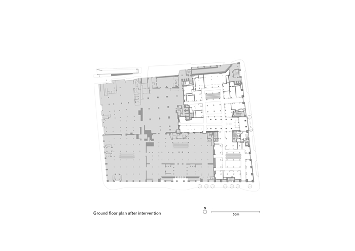
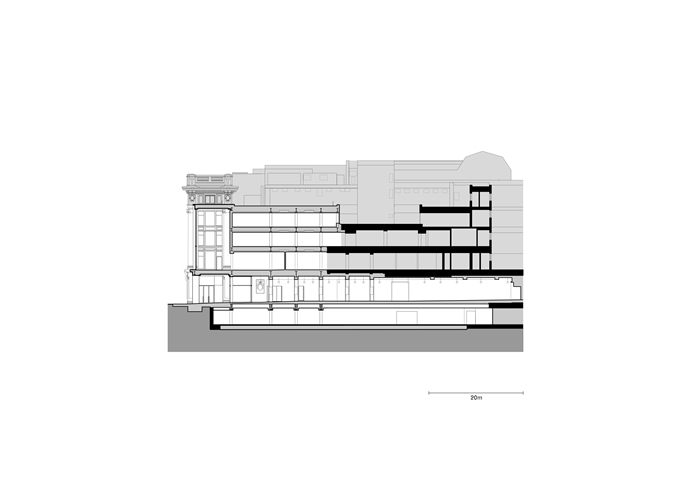
The project assigned to David Chipperfield Architects was in two parts: a new entrance building at the centre of the Duke Street facade, replacing the concrete infill building; and the creation of a new 5000 m2 accessories hall spanning the entire East of the department store.
These elements, together with the opening up of new retail frontage on Dukes Street creates a new coherent identity for the East of the store, improving its urban presence, clarity in circulation and reintroducing the glamour and grandeur of the original building.
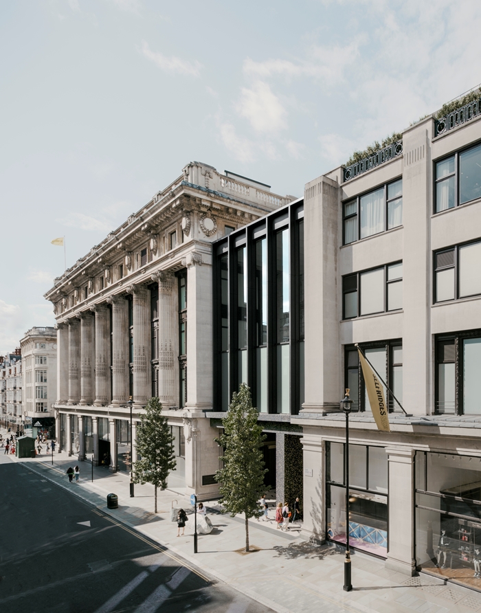
Externally, the new building completes the street facade and unites the historic buildings on either side with a grand Eastern entrance and tall loggia in the manner of the original entrance on Oxford Street. To protect a section of listed facade, the new building forms an open porch at street level and a triple-height, glazed café space on the first floor allowing the floor plates to coincide and continue the dominant cornices and lintels of the existing buildings.
Rather than form a hybrid of neighbouring architectural styles, the new entrance building maintains both structural and visual independence through a dark palette that deliberately contrasts the cream-coloured Portland stone of the adjacent buildings. The upper facade is formed of slender bronze-clad structural columns framing the glazing. These columns rest on a deep black precast concrete trabeated frame with two monumental piers framing the porch.
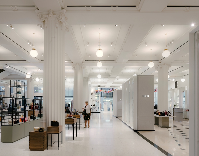
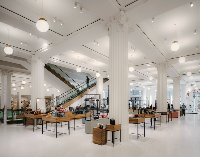
Internally, David Chipperfield Architects opens up and creates a series of new axial routes that improves the store's circulation and navigability. By stitching together the retail spaces of the two existing buildings, a continuous ground floor space for the new accessories hall is created.
This new hall is defined by a hierarchy of architectural elements that operate across the site, reasserting the presence of the building as a singular department store rather than a shopping mall.
The primary elements of the space — floors, ceiling and supporting columns - retain their independence from retail display. Chipperfield re- instates classical columns to their maximum height and the coffers are made visible in their original configuration. In the northern building, a new style of column and coffer are introduced; an interpretation and abstraction of the classical features of the original.
The secondary elements include free-standing glazed screens and partition walls like mini pavilions frame individual brand-run concessions within the larger space and delineate clear walkways. A rigorous set of guidelines for each brand's fit-out ensures they remain in harmony with the overall concept.
There is a subtle served and servant theme at play here, perhaps echoed in the main entrance door pull handles that pay homage to Louis Khan.
With this redevelopment, Selfridges wanted to create the world's largest and most comprehensive destination for accessories, while transforming the store's east side with a monumental new entrance. To realise this vision, David Chipperfield Architects, brought a sensitive and intelligent solution to create a unique shopping environment, while strengthening the link to the street level and establishing a new and stronger architectural identity for the store.
Internal Area 882 m²
Quantity Surveyor / Cost Consultant Alinea Consulting
Services Engineer Waterman Group
Structural Engineer Expedition Engineering
Services Engineer Arup
Project Management Stanhope
Highway Engineer WSP
Landscape Architect Djao-Rakitine
Façade Engineer Thornton Tomasetti
Fire Consultant Jeremy Gardner Associates
Planning Consultant JLL
