The Leadenhall Building
by Rogers Stirk Harbour + Partners
Client British Land
Awards ���������� London Award 2018 and ���������� National Award 2018

The project is a new 50-storey skyscraper in the City of London- a neighbour to the iconic Lloyd’s building by the same practice.
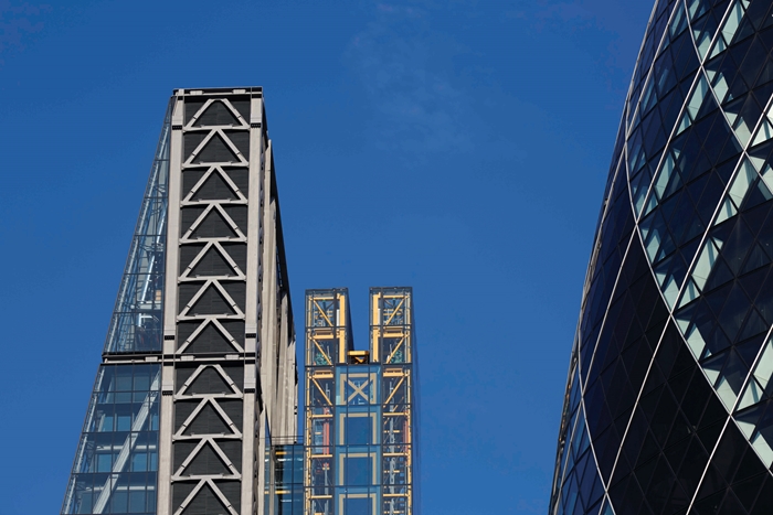
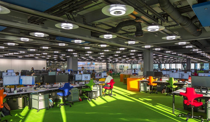
Designed for client British Land, its already famous slanted ‘cheesegrater’ form responds to their desire to be able to offer their own diverse clients office spaces of different floor areas (diminishing as the building rises) and the demand from planners to preserve key historic views of St Paul’s Cathedral, particularly from Fleet Street.
It is one of the more striking and elegant towers to have been added to the City’s jumbled skyline in recent years.
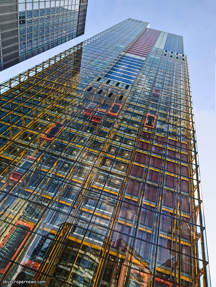
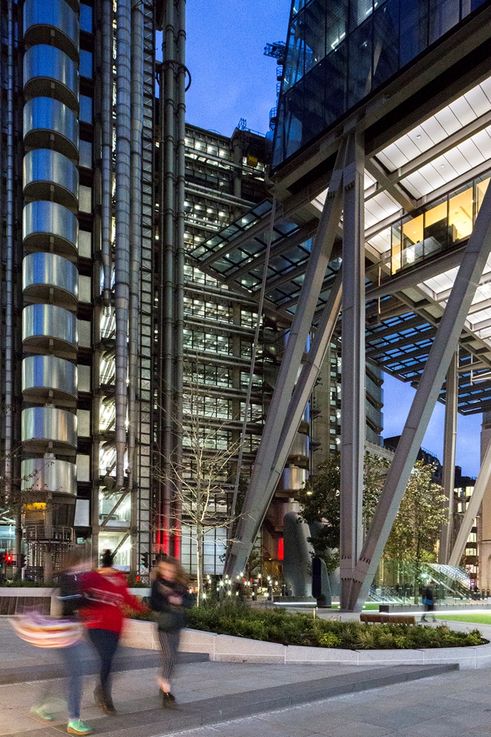
The simplicity of the structural geometry in response to the brief is intriguing, instead of a central core, the building has a full perimeter braced tube, which is visible as a giant bold steel exoskeleton on 3 sides, giving you a visceral sense of the building’s balancing act.
The front façade glazes this over in a huge straight slick shimmering sweep from floor to sky, creating a dramatic contrast.
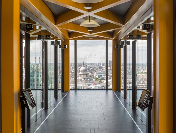
Its theatrical backside ensure all lifts and toilets are choreographed into a circulation and servicing core at the rear, again glazed. This creates a constant intricate dance of lifts of different colours and sizes and their inhabitants, rising and falling, filling and emptying.
Functional necessity becomes something beautiful to watch – almost like a children’s storybook of How A Building Works - and, again, a contrast with the slick front that is achieved with a seamless conviction.
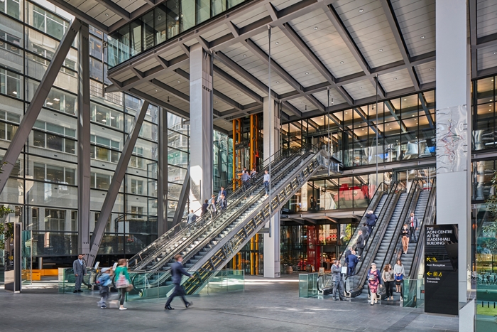
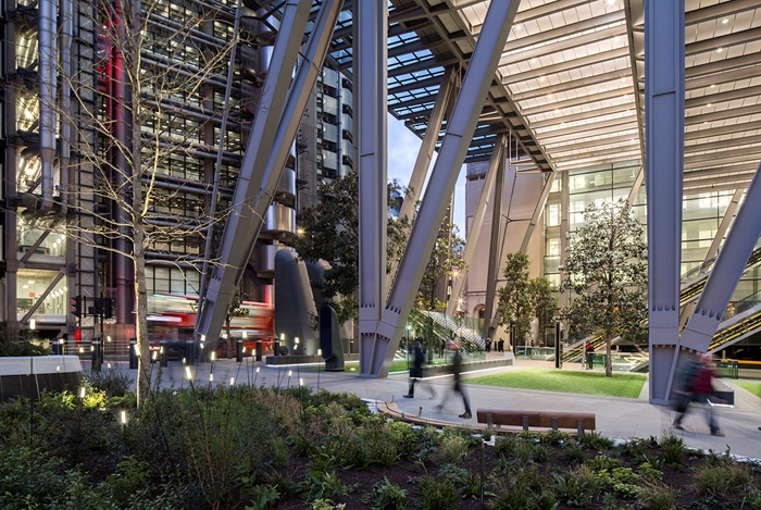
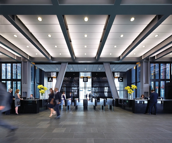
The public space beneath means the building leaves the lower potential seven storeys of its exoskeleton unbuilt, allowing the giant metal supporting ‘legs’ to create and enclose a canopied void – a public space from which escalators soar up to the offices above, and from where you really appreciate their scale and strength.
This is not just an empty gesture, but accommodates a number of shops and cafes around its edges, within the structure, so adds genuine life and additional pavement to the street as people criss-cross through it. Again, this feels quite theatrical. A new N/S route is also provided.
The response to townscape resulted in the decision to align the canopy over this void with the height of the Lutyens building next door is a simple additional gesture that helps the building have some kind of nodding respectful relationship with the older city streets beneath.
Internal Area 84,424 m²
Contractor Laing O Rourke
Structural Engineers Arup
Environmental / M&E Engineers Arup
Quantity Surveyor / Cost Consultant Davis Langdon Everest (now AECOM)
Project Management M3 Consulting
Acoustic Engineers Arup
Access Consultant Arup
Landscape Architects EDCO Design Limited
Interior Design Rogers Stirk Harbour + Partners
Lighting Design Arup
Lifts KONE
