Kettle's Yard
by Jamie Fobert Architects
Client Kettle's Yard, University of Cambridge
Awards ���������� East Award 2019 and ���������� National Award 2019

Jim Ede’s domestic museum, Kettle's Yard, which was established in the 1950s and subsequently extended by Sir Leslie Martin in the late 60s, is given an authentic and faithful enhancement through this careful and sensitive project. By taking reference from Sir Leslie Martin’s extension, which the architects felt had been eroded and degraded by later interventions, their plan was to restore this first major addition to the way it had been when it first opened. Completely convinced by Martin’s solution, the architects were keen to apply the same approach to their own additions.
A brave decision, but one that harmonised with the spirit of the place and its well-ordered chaos. Picking up on Martin’s offset strip rooflights, which give a gentle reflected daylight perfect for displaying art, and the great slabs of timber used for furniture by Ede and Martin in the earlier phases, the architects were able to work in harmony with the treasured early parts of the complex, and add something new and exciting of their own.
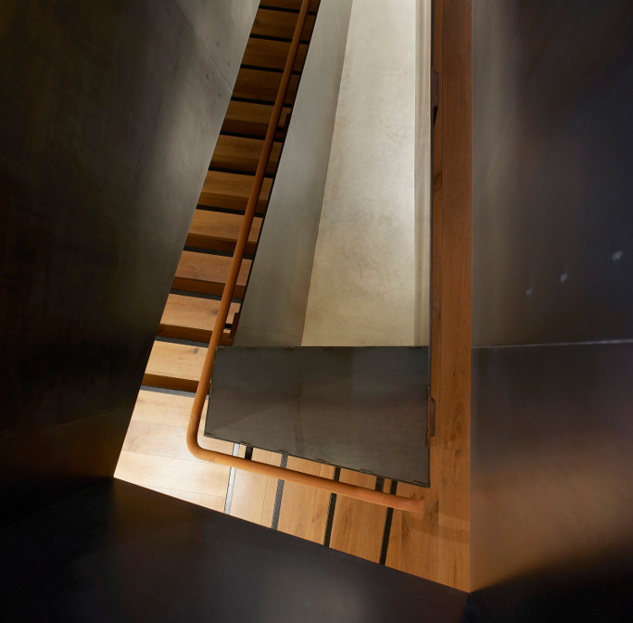
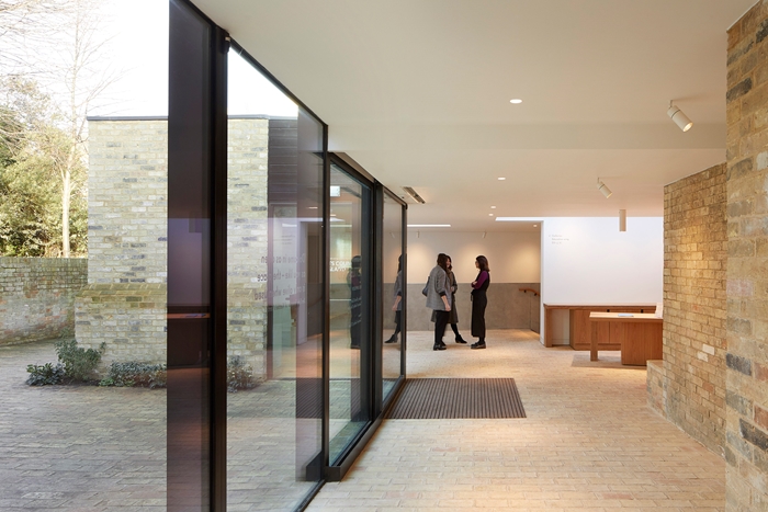
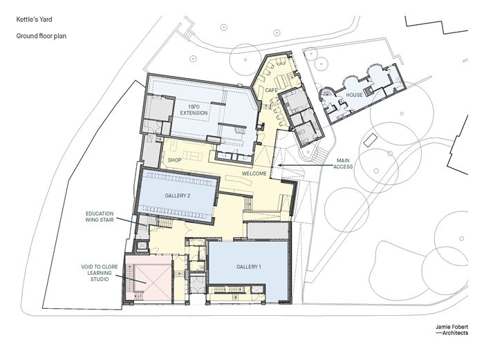
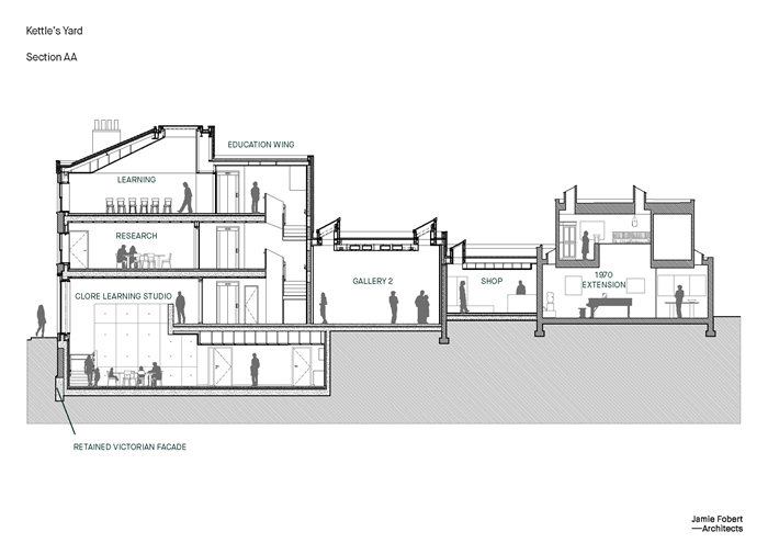
Two strategic planning decisions helped the plan to work in a delightful way. The first was to ensure that you could stand by the glass entrance and look in radial directions that revealed the key amenities – Jim Ede’s house, the café, the entrance/shop/ticket office, and the galleries. This was the ordering principle that could be seen on site but is not apparent before visiting the place. The whole plan is ordered around this radial ‘sweet spot’. The second strategic decision was to create very orderly, rectangular gallery spaces, perfectly proportioned and laid out for international exhibitions, set into the random shape of the site with all its nooks and crannies. This means that the space between the rectangular exhibition rooms (the ‘space left over’) takes random and disorderly shapes, which provide a foil to the exhibition rooms and give a series of opportunities that the architects have exploited in full. Stairs, ramps, circulation space and secondary rooms bend and flex to the given angles.
A deep coherence has been achieved within what had at first been a disparate collection of parts, and a very pleasing combination of rational and idiosyncratic architectural spaces had been created.
Contractor SDC
Structural Engineer Elliott Wood
Environmental / M&E Engineer AECOM
Project Management 3PM
Lighting Design Lightplan
Internal area 1,125 m²


