Eddington Lot 1, North West Cambridge
by WilkinsonEyre with Mole Architects
Client University of Cambridge
Awards ���������� East Award 2019 and ���������� National Award 2019

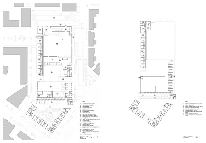
Occupying the central portion of the new Eddington quarter of Cambridge, this was a complex brief with a number of potentially conflicting elements, including a Sainsbury’s superstore, the combined heat and power ‘Energy Centre’, a doctor’s surgery, offices, and a variety of housing units of different types, majoring on affordable units. In response to the varied demands, it is appropriate that two architects collaborated to deliver the project.
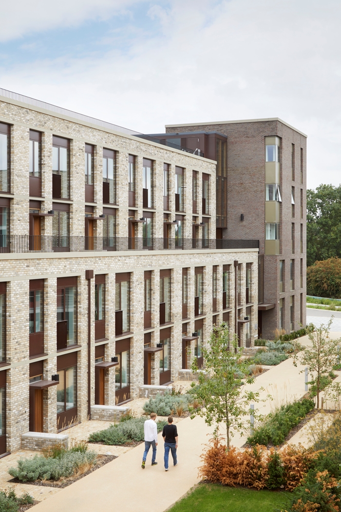
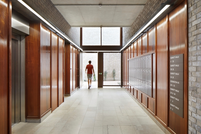
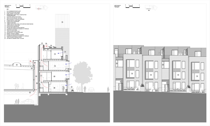
Centrally positioned facing the new habitation’s main square, the large supermarket provided the design’s most dominant component, occupying by far the largest area of the plot. A grand canopy on the main square, marking the supermarket entrance, provides an appropriate focus for the outdoor space, and covers the corporate interior of the supermarket that could have dominated elevations. The architects used a clever device in wrapping single aspect housing along one of the store’s long elevations, thereby completely masking the store’s blank façade. These double stacked duplex units give the street elevations a depth and richness; grouped entrances are pushed into the main elevation line and bay windows pushed out from it. This, combined with small front yards that distance the ground floor windows from the street and roof features that were set back from the main frontage, give a complex, layered aesthetic that resonates with traditional urban rhythms, but is wholly modern in its aesthetic.
Pushing back a little on the original masterplan, the architects successfully argued the case for moving the Energy Centre from its planned position on the southern extent of Lot 1, and moving it to the middle of the site. Facilitating the creation of an intimate courtyard on the southern portion of the Lot, different in character to the external spaces elsewhere in Eddington. and wrapping housing around it that looks both onto the courtyard as well as out across the site was a clever bonus.
Flats around this southern courtyard are largely deck access, but again the deck has been given a generous width, enough to provide a buffer space between the flat windows and the walkway, which is enough to create a suitable balance between public, semi-public and private space. Much of this is simply created by a change of materials, which is encouragement enough for residents to colonise their semi-public space with plants, seats and other outdoor features. The flats themselves are well laid out enough to feel generous, and the use of built in cupboards and wardrobes demonstrates that this is a better use of space than can be achieved with free standing furniture.
The Energy centre is a contrast to the look and feel of the other elements, being simple, bold and functional. The delivery court is well hidden, and this element integrates remarkably well with the other elements.
This is an exemplar of integrated urban design.
Contractor BAM
Structural Engineer Aecom (then URS)
Environmental / M&E Engineer Aecom (then URS)
Quantity Surveyor / Cost Consultant Gardiner & Theobald
Project Management Turner & Townsend
Landscape Architect BBUK
NEC3 Supervisor Calfordseaden
Acoustic Engineer Aecom (then URS)
Internal area 19,444 m²


